ROKU ZERO
Intro
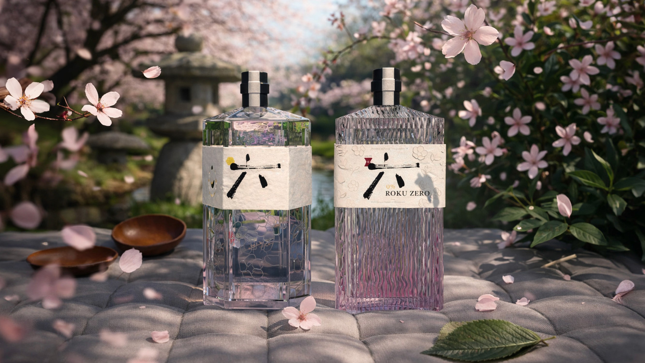
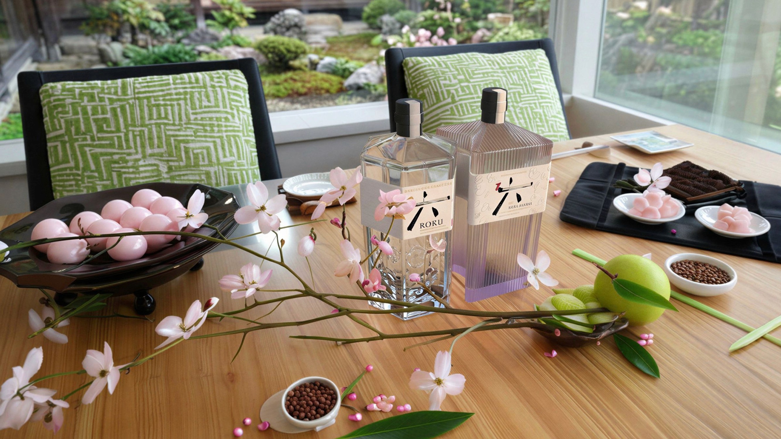
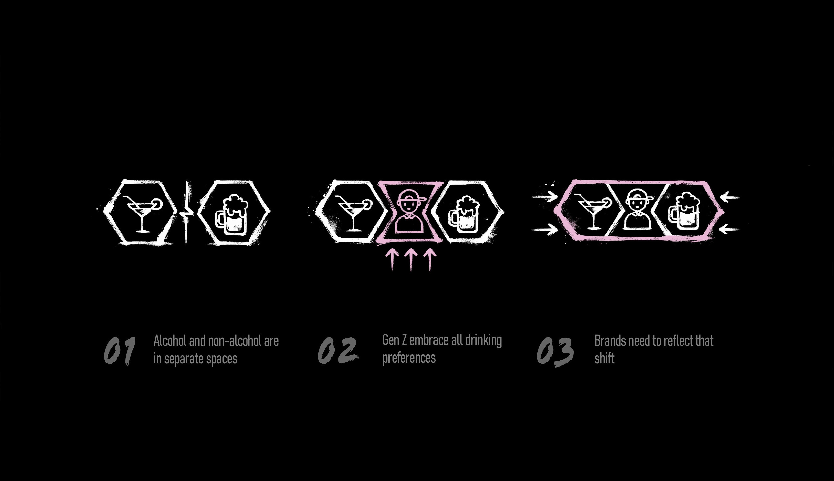
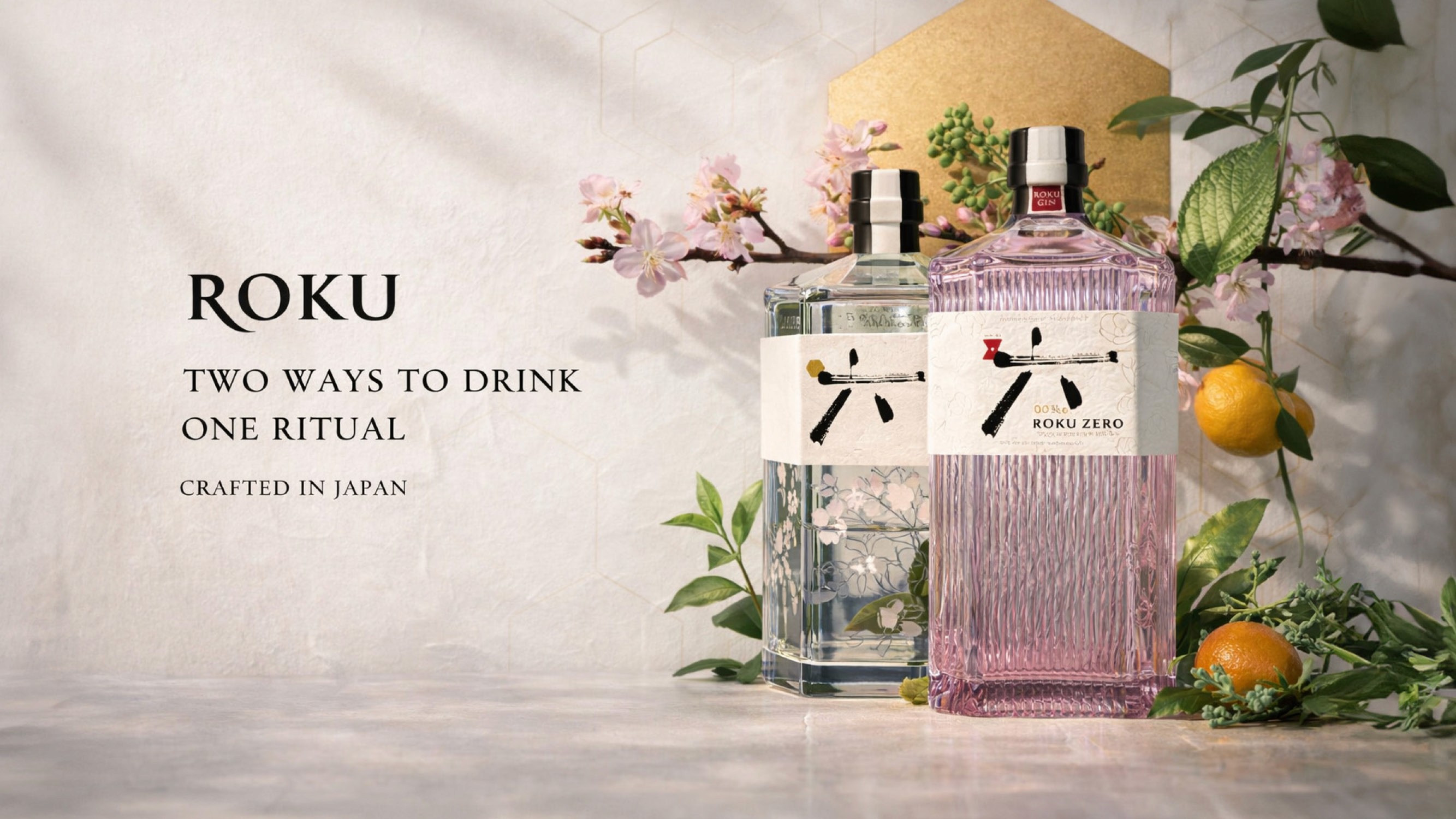
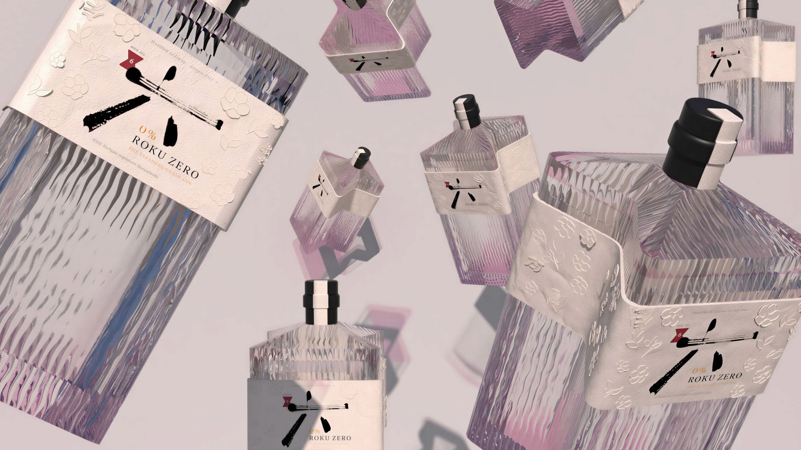
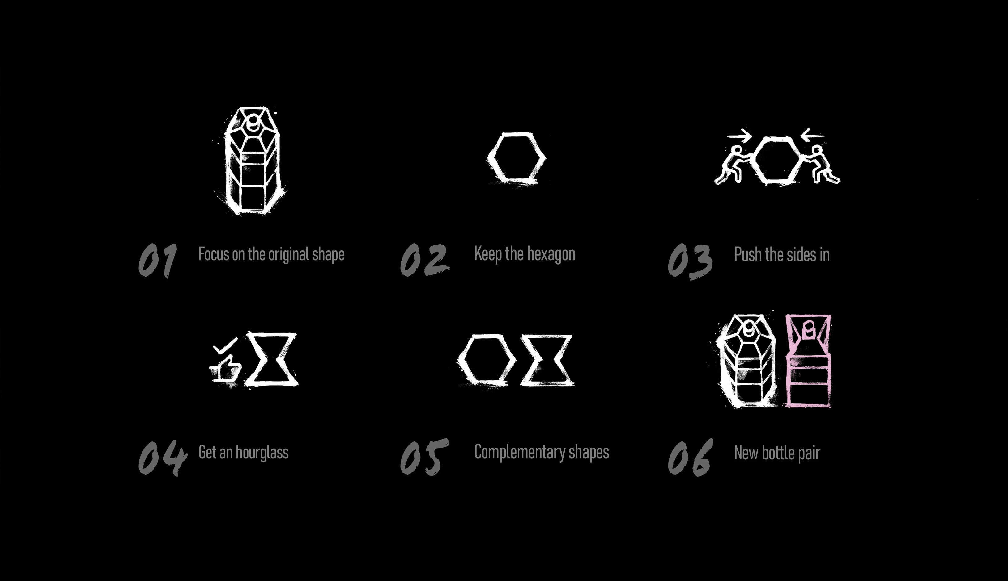
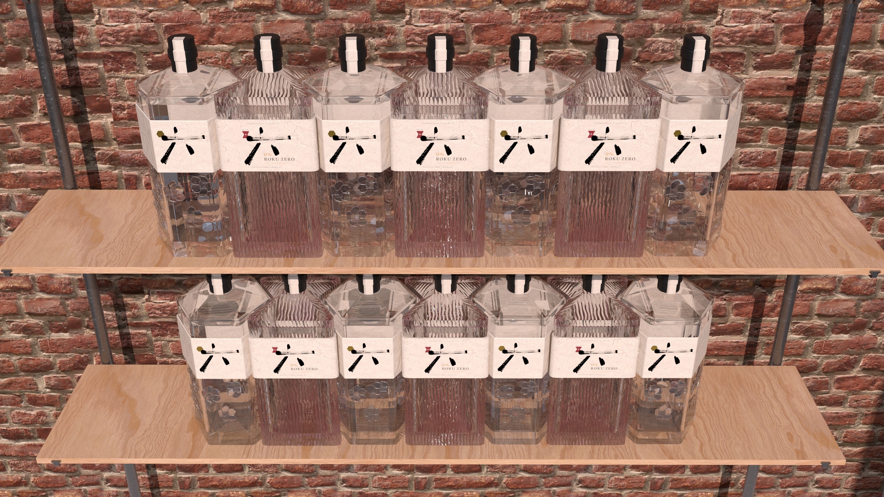
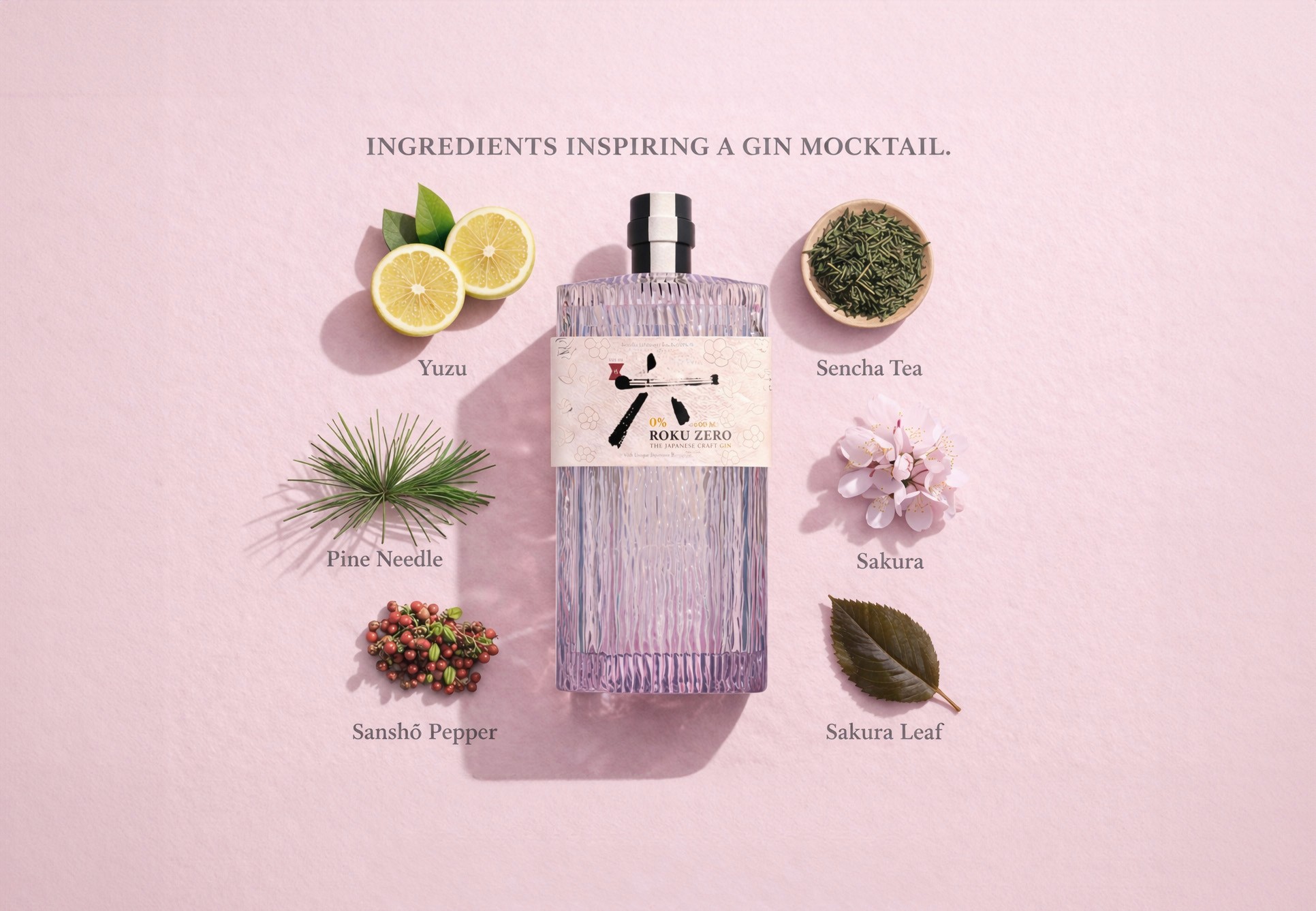
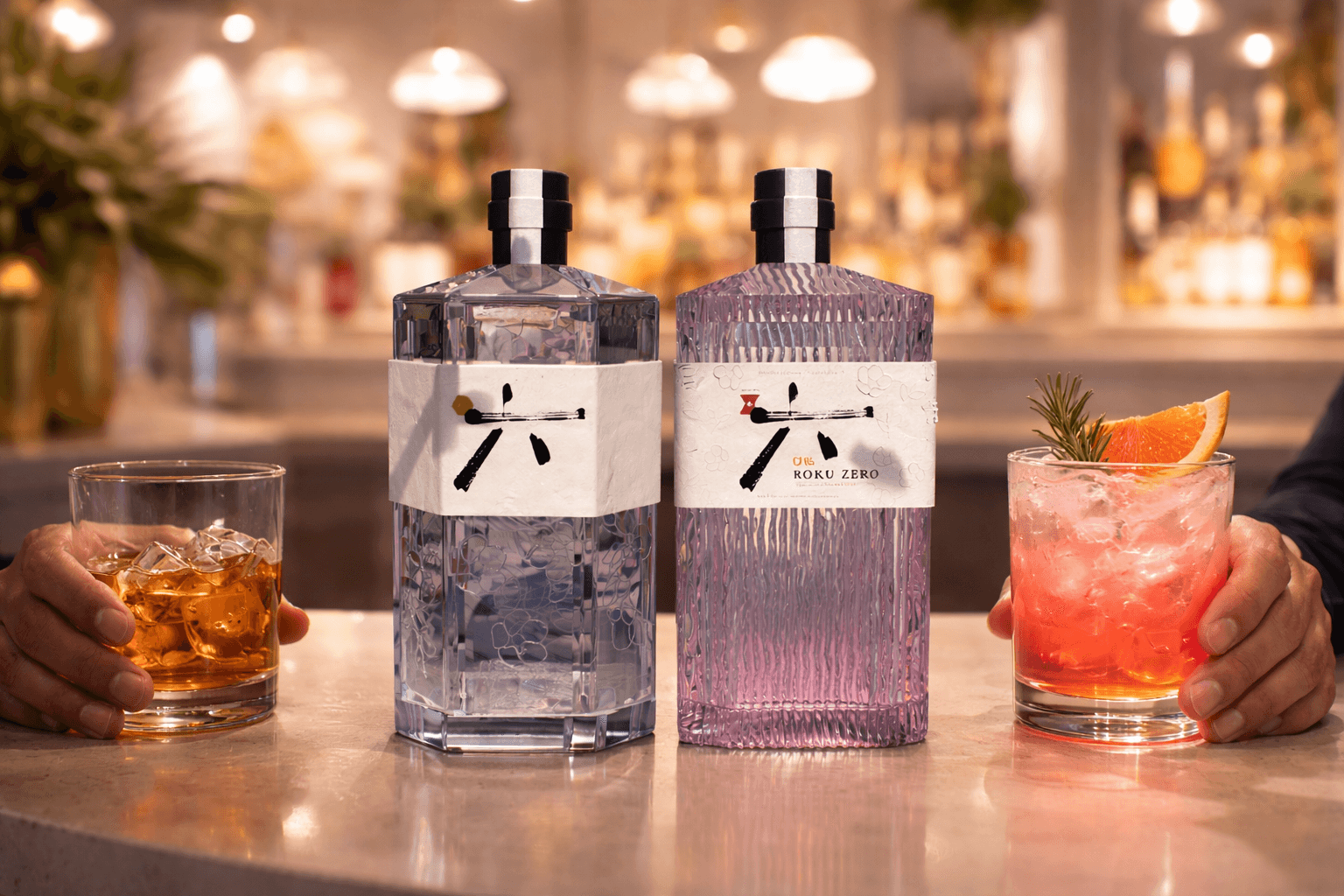
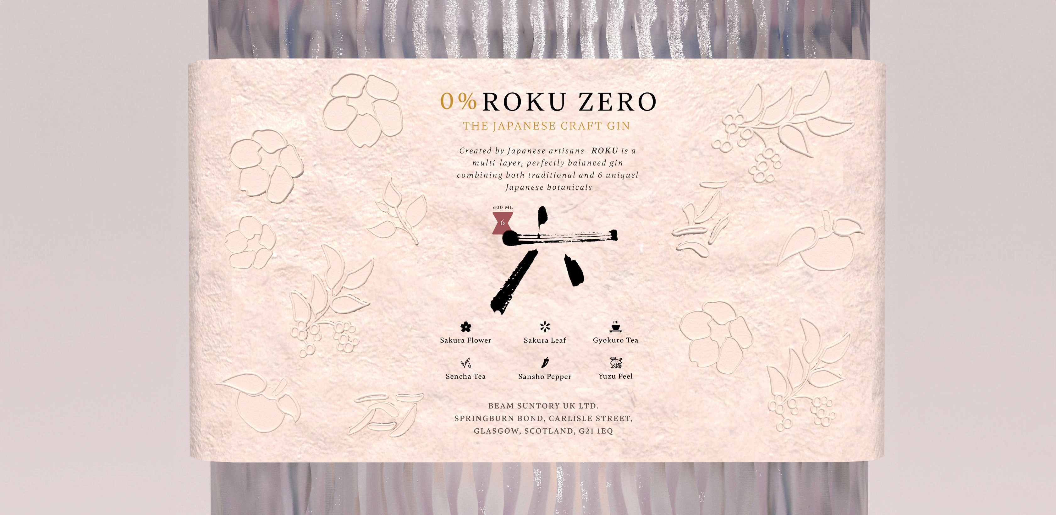
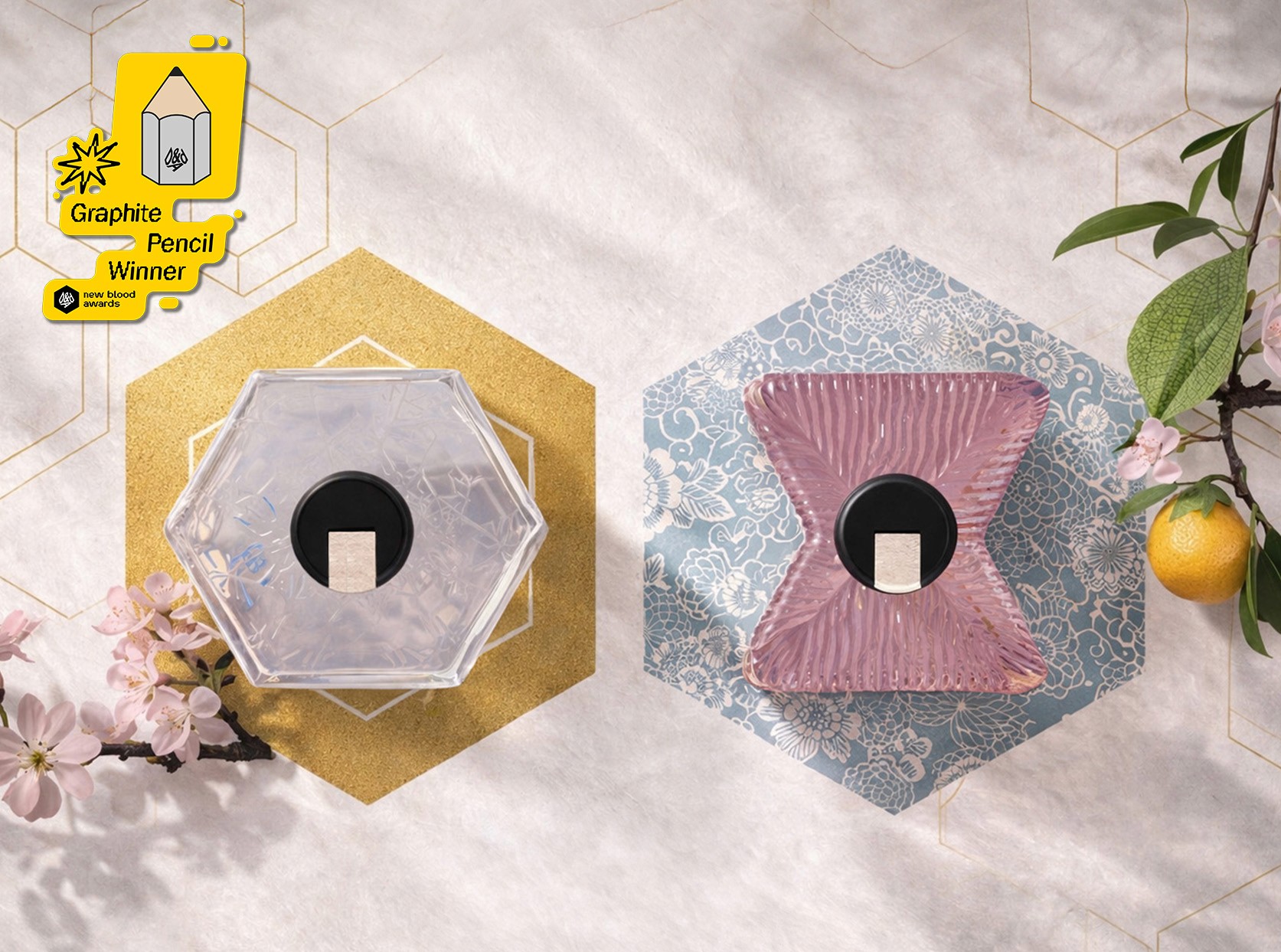
Built for Suntory Global Spirits as part of D&AD New Blood. Winner of a Graphite Pencil. Roku Zero responds to a growing challenge in the drinks industry: non-alcoholic options feel secondary on shelf. The brief asked how Roku Gin could create a 0.0% extension that felt as premium and desirable as the original, while connecting with Gen Z’s more flexible approach to drinking. The solution was a complementary bottle system designed to place both products on equal footing. Thanks to Roku Zero’s interlocking form, storing both bottles side by side becomes the most intuitive and space-efficient way to display the set. The packaging subtly shifts shelf behaviour, signalling that alcoholic and non-alcoholic options are equally valued choices. Roku Gin’s emblematic hexagonal bottle shape is a key brand asset, representing the six Japanese botanicals used in the gin. For Roku Zero, the six-sided form was preserved and reshaped into an hourglass silhouette that physically connects with the original bottle when paired together.
Deliverables:
Brand Strategy
Branding
Creative Direction
Storytelling
Packaging Design
FMCG Branding